
HOW TO SELECT THE “PERFECT” BRAND COLORS FOR YOUR BUSINESS
This may sound uber “unprofesh,” but my favorite tip for properly choosing your brand colors is to “follow your gut.”
Colors, we've seen before, quickly convey emotions and affect people's moods. Whether you're choosing paint for a room or are designing a website and brand, the Psychology of Color, which matches specific Pantone colors, can come in handy and following your gut makes more and more sense!
So many times, wellness entrepreneurs and coaches choose brand colors that are trending or that vibe with their industry only to feel a disconnect with their brand and like something just isn’t quite right later on.
I’d like to go into some design techniques for picking your brand colors, but first—think of colors that make you happy and smile. Consider the colors you are naturally drawn to.
If you’re branding your business as a business that’s true to your authentic self, the right clients will fall in love with you and your brand.
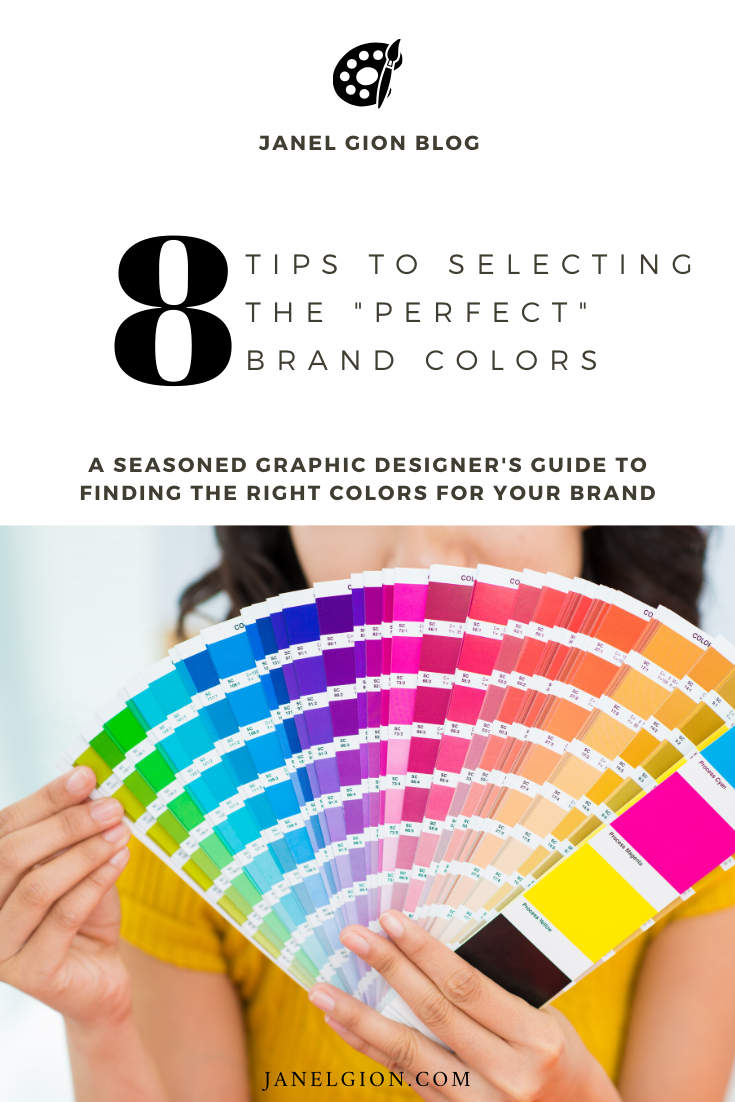
Choosing a color scheme is such a daunting decorating step leaving many people overwhelmed in their home and I see it all the time in branding too, but it doesn’t have to be friends! After all the human eye can see about 10 million colors. And that’s not even close to how many actual colors there are. We’ll just say there are heaps, shall we? So if I still have you (and you’re not running scared at that thought?), read on to decide on a color scheme for your website and branding!
WHY A WELL-DESIGNED WEBSITE IS IMPORTANT
When a room is well designed you will barely notice as it feels so natural. We can use this same theory in the same way, designing your brand and website. It is important that our homes are unique to ourselves and a reflection of who we are. (Also is true for your brand!) You do not need to be a designer to create a beautiful website or home. You already have your own style, it’s just a case of tapping into that and implementing it into your brand with a few tips.
In the same way a room can be poorly designed, as a result, it can affect your mood and the way in which you interact (often subconsciously), if you brand isn't resonating with you, you won’t connect with it and worse case, won’t share and market your business as a result!
Your brand should be visually pleasing to yourself and others around you. Even if it’s not the personal style of others, your balanced and peaceful space will still have visitors feeling welcome and happy to be there and WORK WITH YOU!
Don’t think that brand design needs to be overly difficult or overwhelming to find inspiration. This is why when I work with my clients, we share inspiration, easily found on platforms such as Pinterest and Instagram. I love creating Pinterest boards to look back on to see common themes emerging. Select something that you’re drawn to. It could be a style of interior design, a piece of art, an outfit, packaging… anything really! This is why I have clients Pin things in these categories like interior design style, fashion etc… What are you drawn to to wear, decorate with, hang on your walls…
2. HOW DO YOU SHOW VISITORS WHO YOU TRULY ARE THROUGH A BRAND AND COLOR?
If you edit your photos with a dramatic dark look, it would be inconsistent and also off putting if you have a light and airy brand with soft and neutral colors.
If you are an energetic and bubbly person who wears bright colors all the time, why would you want to have a brand that is light pinks and mint or dark and bold?
Be who you are and project the feelings you want your clients to feel when they work with you!
3. HOW DO YOU WANT THEM TO FEEL?
First and foremost, before we get into anything to do with color, you need to consider these things:
What is your website primarily used for?
How do you want visitors to feel?
There is a psychology to color (I’ll get to that more in a second) but it makes sense that a big decision such as the colors in your brand would impact on your mood when you share it online.
I’m about to contradict myself a bit here but often times people want to pick their favorite color and I still start there, however it’s not always going to be the best choice for you for the primary color on your site. Think about whether you can live with this color every day and about how it’s going to make you feel when you visit your site and social sites everyday. If you don’t think you can live with using it in your branding and marketing and in ALL the things as yoru primary brand, but would still really like to have it in your life, you can try using it as an accent.
4. NOW, LET’S TALK ABOUT THE PSYCHOLOGY OF YOUR BRAND COLORS
Anytime we talk about color psychology, we’re talking about the emotions that are evoked from a certain color in you or potential clients. It’s really important to remember that every individual is unique and has a unique background, so people do experience colors differently.
For the most part, I’m talking in general here.
While we can’t generalize how every person will feel when they see a certain color, we can take a look at how each color makes you feel, how that pertains to your personality and brand, and how that relates to how you want your potential customers to feel when they interact with you and your brand. (hint: you are your brand in the case of building a personal brand!!)
By choosing a certain brand color, you can help reinforce who YOU are in your brand and make it stand out from others within your industry based on what we know about the psychology of color.
What emotions do you feel often? What emotions do you want your clients to feel when they engage with your brand?
Below is a color wheel which can be broken down in the three main color categories and helps to see how and why colors work together or in opposition to one another.

PRIMARY colors: Primary colors are only created by themselves and can’t be created from mixing. These colors are yellow, red and blue.
SECONDARY colors: Secondary colors are created by mixing two of the primary colors listed above. They are orange, purple and green. e.g. to get orange you need to mix red and yellow.
TERTIARY colors: Tertiary colors are created by mixing one primary and one secondary color. e.g. a yellow-orange is made by mixing yellow (primary) and orange (secondary).
5. COLOR WHEEL 101: EVOKING EMOTION WITH WARM AND COOL COLORS
WARM/ACTIVE colors: Energetic, invigorating, exciting, stimulating, upbeat (red, yellow, orange). When designing with bold warm colors, using neutrals, natural light, and contrasting colors will create a sense of strength and confidence.
COOL/PASSIVE colors: Serene, calming (blues, green, purple).

NEUTRALS: Technically these aren’t on the color wheel (whites, grey’s, blacks and browns). They don’t over or under stimulate emotional response. Neutrals are great if you get tired of a lot of bold color or would rather start with a fresh palette and build. You can layer neutrals to create depth. You can also gradually add small amounts of accent colors through secondary and tertiary color.

When selecting a warm or cool color scheme, often including an accent color from the other scheme will create balance. So if your main colors are blues and greys, pick something warm to accent. While it can be oranges or reds, it doesn’t have to be. Find warmer tones in browns, tans and greys.
6. COLOR WHEEL 101: COLOR SCHEMES
Let’s look at how to implement colors with color schemes across your brand and what to consider. These are purely suggestions and you can always deviate. (please do!) As I always suggest, guidelines are a great place to start, but where the confidence comes in is when you take the leap, trust your gut and go all in!
If these make your head to hurt, don’t worry – you’re not alone! You don’t need to memorize ALl these options. However, if you would like to take things up a notch then read over these schemes.
COMPLEMENTARY color SCHEME: This is a scheme with two colors that are opposite on the color wheel eg. orange and blue.
ANALOGOUS color SCHEME: Taking a section of the wheel such as 3-4 colors that are grouped together.
TRIADIC color SCHEME: Made from 3 colors, evenly spaced on the color wheel. The basic of these are Primary colors (red, blue, yellow) and Secondary colors (orange, purple, green). However, there are other triadic schemes that you can choose.
SPLIT COMPLEMENTARY color SCHEME: A little more complex. Consider a complementary color scheme. But rather than using one of those colors we instead go for the two colors on either side. e.g. using the orange/blue complementary combination, we will keep the yellow color and select the colors on either side of blue which are blue-green and blue-violet.
DOUBLE COMPLEMENTARY color SCHEME: These are quite dynamic schemes. Take two different complementary colors/schemes and combine them into one area. So you actually have 4 colors.
MONOCHROME color SCHEME: A monochrome scheme is one color, using different tones within that color. You can actually use any color to create a monochrome scheme. Although in interiors, typically people associate them with blacks, whites, greys and browns.
(CHALLENGE: Try applying these to your interior design and decor, have fun with it and see what comes of it! If you came to my home, my website might not surprise you what it was inspired by! )
A great tool for some of these color schemes that you might enjoy is the Color Supplyyy website.
7. COLOR PSYCHOLOGY
There is a little secret that marketers use to draw us in. It’s called color psychology and is defined as the study of colors in relation to human behaviour. In marketing and branding, using certain colors evokes an emotional response and influences things like buying patterns or how we perceive a particular brand.

In the same way when we walk into a room, or visit a website, the colors instantly make a connection and communicate a feeling. This is why the first question of how you want your online space (and brand and website) to feel is so important. If your site is too heavy and dark and cluttered with a rainbow of too many colors it might not be somewhere we want to interact with for too long.
8. IMPLEMENTING YOUR BRANDING COLOR SCHEME
Where are the colors going to go? Decide if you would like to keep a base color throughout the whole site, perhaps in the wardrobe you choose for your branding photoshoot, adding some different colors in various pages. Perhaps you would like to stick to the same palette through the entire site.
If you’re after a fast and easy way to do this try by starting with a fairly neutral base and then add 1-2 accent colors. You can pick these colors via any of the suggestions in this blog post (and then some) however the easiest way would be:
select 2 colors next to each other on the color wheel or
select 2 colors opposite each other on the wheel
You can then add these colors in through items like accessories in your photos, buttons, borders and graphics.
Whatever your branding color scheme (even monochrome), you should have at least three different colors to create balance and depth. So as above, you’ve started with at least one neutral then added color with 1-2 accents. Don’t forget that one of your colors can always just be a lighter shade of another. Typically 3-5 colors in a palette is a good balance, however, there really is no rule on the maximum you can have.
If I leave you with nothing more than THIS tip. PLEASE do not think that you have to stick to your initial brand color palette for the rest of all time, forever and ever!! It can evolve! Just like you! Just like any visual aesthetic, interior design taste and trend, this is a guide only and you’re allowed to change your mind!
If you don’t like to mix orange with your blue than try pink. I know I’ve said this so many times! But I really want to encourage you to learn, gain confidence in using your colors in all areas of your brand and then use that knowledge to bend the rules. It’s then that you’ll really start to have some fun with marketing your business and showing up as YOU and how you want to be seen and viewed as the expert in your field with YOUR footprint (not the other girl).
As I write this article I am about to take a stab at updating my own website. I love my brand color scheme, but a face lift never hurt anyway! (well at least online anyway) :) Since it’s my own website, I now get to “renovate and decorate” just the way I like which is great and am even starting to schedule and plan MY next branding shoot too!
If you use any of the tips in this article, you should definitely share with me on Instagram or Facebook tagging @janelgion. Even send me an email!